Monday, August 30, 2010

A Modern Family Portrait

I love seeing the various prints that artists/Etsians sell on Etsy- especially when they have to do with family, love or pets. A seller that comes to mind immediately is Nella Designs.

She offers custom work as well as stock prints that are oh-so-cute.

My most favorite though is a new Etsian- ishootnouns

Her prints are around the $18.00 mark, but being that we’re saving up to buy a house and all, I wanted to save money, yet have a family silhouette print of our own.

Remember this frame?

DSC_0066

I bought it for $4 at a local antique (ok, junktique) store. I had thought about making it into a chalkboard or a memo board, but one day, inspiration hit and I ended up with something way more fabulous and chic.

I looked around my house and computer for awhile, and I saw this picture from our engagement pic session:

IMG_3786

And I also found a picture of my dear Pee Wee…which I now accidentally deleted from my phone.

Then I got to work in Photoshop and created some silhouettes (took me about 15 minutes at most). Add in some black spray paint + some metallic silver spray paint and you have this beauty.

DSC_0185

DSC_0189

DSC_0190

 DSC_0193

All the materials I had on hand, so the grand total was $4. The floral print I sanded down a bit and spray paint black to make it look like a mat around the image. The image is printed on plain white cardstock on my laser printer. Not too bad for less than an hours worth of work, huh?

I look forward to hanging this piece in our future home…maybe in this spot.

DSC_0386

This post is linked up at The DIY Show-Off. :o)

Thursday, August 26, 2010

King Me: Part Deux

I’ve mentioned before on this blog that we have a FULL bed. Literally- it’s a full size and it’s full. Me + DH + Pee Wee=FULL.

I am sick of it! As much as I love my boys is as much as I would love some space and some peaceful sleep. It’s no surprise then that I really, really want a nice king bed for our master bedroom.

I am torn, though. Very, very torn.

In a perfect world, I’d buy this bed from ZGallerie

bed

At $1900 plus tax plus the Uhaul/gas to and from Austin, it’s easily a nearly $2,500 bed without the mattress. INSANE.

Yet, I am totally serious about saving up and buying it. I adore this bed. Like, I see hearts and stars everytime I even think of this bed.

I’ve scoured the net for something close, and have come up empty handed for the most part. My fave thing about this bed is how grand the headboard is and how deep the tufts are. It is perfection. Simply perfect.

Contender #2 is this very beautiful bed from Rooms To Go

roomstogo

It’s from their Cindy Crawford collection, and at $999 plus tax and the $70 delivery fee, it’s a heck of a lot more affordable than the ZGallerie bed. But…what is up with the little posts near the headboard? I would definitely need to see it in person before making a decision. But, I love the color of the padded headboard and the decorative touches. It’s nice and I could see myself liking this bed for many years.

Contender #3 is a very, very inexpensive bed I found while browsing JCPenney.com 2 nights ago.

image

At $649 (bed + shipping) plus tax, it’s by FAR the most affordable. It’s also the most traditional looking. It also is a lot like the one the current owner has in the master bedroom:

DSC_0377

Kinda. Sorta. She has a queen mattress on it right  now, so it looks kinda off.

What would you all do? Mind you, I’ve never seen any of these in person, so I am going based off what I *think* I would like. We are planning a little day trip to Austin during which I could see both the ZGallerie & Rooms to Go beds in person, but the JCP bed would be purchased unseen.

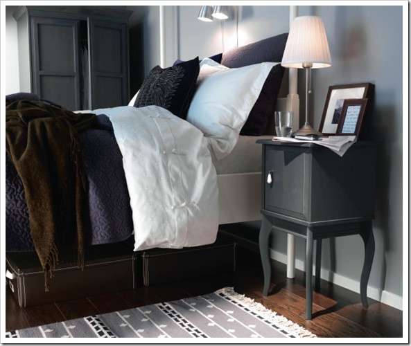
The overall feel I want for our master bedroom is relaxing, hotel-like and a touch of glam. Here are some accessories I’d love to incorporate into our bedroom:

image

Mirrored nightstands, JCPenney (iffy on these…might be too trendy)

bed2

Tufted bench, hotel like bedding and uber chic lamps. Picture is from Decor Pad

curtainswall 

Loving the colors, the chandelier and the bedding. Picture is from Decor Pad

image

Stunning floor mirror from Neiman Marcus

edlandnightstand

Love the Edland Nightstand ($149 each, the one shown above is $79) via IKEA

edland

Another look at the Edland collection. Simply beautiful.

Such gorgeous colored bedding from ZGallerie (and its on CLEARANCE!)

So, given my style and my budget…which bed would you choose? I don’t want to have to buy another bed for a long while, so I want something that can with stand my finicky moods/decor styles.

Help me!

Wednesday, August 25, 2010

Lighten up.

I haven’t yet started a countdown to the number of days left before we are homeowners. I know it’s really close, but yet it seems really far. To help the days pass quickly, I spend lots (an obscene amount, really) of time looking at stores, blogs and catalogs to decide what to buy to make our home feel more “us.”

While the house is lovely, it could use some nice modern touches. And some traditional touches. I feel like my design ideas are somewhere between wanting to honor traditional features such as crown moulding, chair rail and hardwood floors and wanting modern touches like fancy lights, modern furniture, and luxe accessories. Is that what people who describe their style as “transitional” mean? Because whenever someone says they have a “transitional decorating style” I usually smile, nod and wonder what the hell they mean.

Anyone know?

This whole modern vs. traditional struggle reminds me of a conversation Daniel (my hubby) and I had when we first put the offer on the house. Here’s a summary.

Daniel: So, since our kitchen has oak cabinets and white appliances, I really think we should keep a “country” feel in our kitchen so it doesn’t look weird.

Me: <brain wanders to my mom’s cow-themed kitchen> Daniel, if you’re telling me this, I do NOT want to buy the house. I will not do it. Just because we live in the country doesn’t mean we have to be country. I am calling the realtor and taking back the offer. OHMYGODICANNOTHAVEACOUNTRYKITCHEN.

Daniel: Calm down.

Me: DONOTTELLMETOCALMDOWN. COUNTRY KITCHEN?!?!

Yeah. I am a little dramatic, I know. I am fine with it.

Three weeks later we are still under contract, and I have convinced him we can make the kitchen modern. I’ll just stain the cabinets one weekend when I can ship him off to a football game with his dad. No worries.

Anyway.

One of the first things on our to-do list is to replace light fixtures. Why? Well, frankly some of the ones in the house are dated (AKA: fugly) and they don’t serve their purpose. For instance, the hall light doesn’t really light the hall. And the foyer light is teeny tiny. So, let me show you some of my ideas and you all can chime in!

We’ll start with the foyer.

DSC_0363

Do you see that TEENY tiny light up there? Stop squinting, I promise you it’s there.

Well, the sparkly lover in me wants to put up a grand chandelier, but I realize in the space we have, that would look tacky. Hmph.

Here are some of the contenders for the honor of foyer light:

Foyer1

$110, from Overstock

Pros: Modern, timeless, simple.

Cons: Kinda expensive for what it is.

foyer2

$170, from Overstock

Pros: Modern, sparkly, not too sparkly

Cons: Sparkly, will it hang too low, and it is also $$$

And if #1 and #2 had a baby, here’s what the spawn might look like:

foyer3

$124, from Overstock

Pros: Flush to the ceiling, simply white, little dash of sparkle

Cons: None?

Which is your favorite? I am really, really leaning towards #3. Have you seen some on other sites that I might be missing? I love, love, LOVE me some Overstock, so I stalk their stuff like everyday.

Moving on down to the hallway, which is another problem area.

DSC_0367

Again, small light for a long/narrow area.

In this space, I don’t want one light because I feel like it’ll give off a UFO glow, so I thought a track or rail lighting system would be fab. Bonus points if I can move the lights in different directions/positions.

rail

$73, from Overstock

Pros: Not bulky, 4 lights and they pivot.

Cons: Not a fan of the finish (bronze)

image

$36, from Home Depot

Pros: Inexpensive, satin nickel, pivot lights.

Cons: Do not like the frosted shades very much.

image

$80, from Lamps Plus

Pros: Modern, yet classic. Affordable!

Cons: Don’t like the pointy backs of the lights.

Overall, I wish I could have the first set in a satin nickel finish. I love how the lights look like photographer’s lights.

Seen anything like that?

And in the kitchen there is a HUGE light. It’s the big box style, and I do not have a picture of it. Shucks. My ideal thing to do in the kitchen would be recessed lighting. However, I am cheap and want to DIY the installation of the recessed lights, but I am also too chicken to actually attempt it. Sigh.

Well, what do you all think? Are there better choices out there and I need to keep looking?

Sunday, August 15, 2010

We are buying a house.

Oh my gosh.

We did it…well, almost. I guess it’s not *technically* done until closing, which is set for October 6th.

But most everything looks good to go, so yay!!

Quite honestly, I don’t think I’ve ever been so scared or happy in my entire life. I can’t wait to make the house our own, but I am also terrified of being a homeowner.

Before I go into the details of the house, I want to share what I learned during this process. I won’t go into loans and all that sort of stuff because that is something that will be unique to each individual, but I will share things that I feel everyone can appreciate. Here we go.

1.) PATIENCE. I almost was thisclose to giving up the search when our first offer on another house was rejected. Like seriously. I was devastated. No one likes rejection, and I sure didn’t like feeling like I was dumped by a guy I really liked. So, luckily, we took about a week off to gather our thoughts and we got back to looking. We saw another 3-4 houses that were AWFUL and overpriced. Then it happened. We found THE house. We just knew. I never believed people when they told me you just “know” when you walk into the house, but trust me, we knew. Daniel was ready to put in the offer the second we left the house, but I was hungry. I have priorities. So, we put in the offer the next day, the seller accepted, and the rest is history.

Looking at so many houses also put in the situation of knowing when we found a real gem or a really good deal. And then we jumped feet first into the process and felt no regrets.

It felt right.

2.) LUCK. Yes, I firmly believe luck has a little to do with the process. But maybe it is more fate than it is luck, but to me they went hand-in-hand for us. We happened to be lounging around late one Saturday evening and noticed a NEW listing on Realtor.com (which we stalked OBSESSIVELY) and the house looked ok from the outside. The specs were nice. It was in the budget. Cool. We saw it Monday, put the offer Tuesday, and the real estate company didn’t even have time to put up a FOR SALE sign. We snagged it up quickly. Here’s where I think luck came into play. So, patience + luck=house!

3.) PRICE. Some houses are overpriced. Ok, most. Few houses are underpriced. We found that our house was thought to be worth in the $150K+ range, but the seller just wants out, and therefore priced it to sell. This means we offered asking price and asked for the patio set to be thrown in (it’s really nice). I know many think we probably are foolish for giving her the asking price, but we know the house is worth a lot more because of the amount of houses we’ve seen. Yes, HGTV shows lead you to believe that you can get thousands off a house, and maybe in those larger markets you can, but here in Beeville, someone probably would have gone over asking price, and we didn’t want to take that chance. Therefore, know what a house is TRULY worth to you and compare that to what you can/want to pay. We are 100% happy with what we’re paying, and it’s still well below what we budgeted.

There ya have it- the 3 most important things I feel a buyer should know. Be patient, what’s meant to be will be (whether you like it at the moment or not), be persistent, and know a good price when you see one. I don’t want to say things like have a great agent, yada yada because I felt our agent was just there to show us houses. At the end of the day, she basically did what we asked her to do, so we had to be educated, smart and decisive. None of those have anything to do with our agent. If you happen to have a fantastic agent, more power to you, but we just didn’t find our agent really made a difference during the process. We found the houses, she set up the tours, we told her our offer, she typed it. End of story.

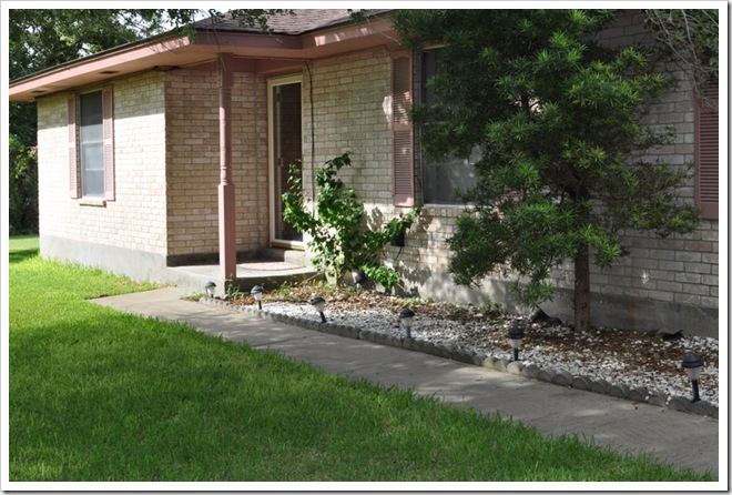
Now let’s look at our future home. I have BIG plans for this home! We plan to be here a long time.

This is the outside of the home. We plan on chopping down that tree because our inspection report told us to. I would love to plant a lovely flower garden where the rocks are. Also, the shutters and trim need an update. We’re thinking black shutters and a taupe/ivory trim.

DSC_0394

You walk into the front door and it’s a little foyer area, which I LOVE. I hate houses where you step right into the living room, just not what I want in my home. That light fixture will most definitely be replaced.

DSC_0363 

You keep walking straight and you end up in the living room with a lovely fireplace.

DSC_0359

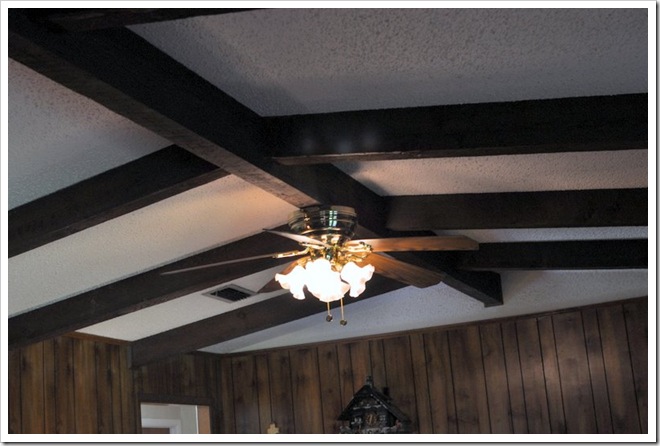
Beamed/vaulted ceilings.

DSC_0354

Wood paneling…yuck. This has got to go! For now, I’ll probably just paint it.

DSC_0358

French doors lead outside into the backyard. I’ll show you the backyard later. You can also see the patio set I negotiated into the deal. Squee!! Oh, and the doors have the blinds IN the door. Awesome!

DSC_0355

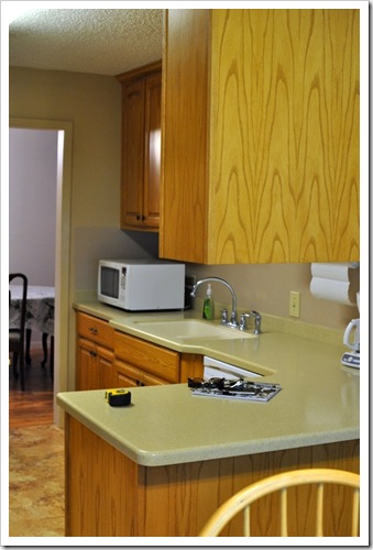
Then you walk into the newly renovated kitchen. Very traditional for my modern taste, but Daniel and I have some ideas of how to modernize the space.

DSC_0345

DSC_0342

Cute breakfast nook with a bay window. Perfect spot for a banquete, right?!

DSC_0338

Laundry room.

DSC_0340

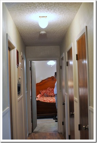
Hallway leading to all 3 bedrooms (at the end is the master bedroom) The hallway could use better lighting because that light is pretty awful.

DSC_0367

Nice updated bathroom. Traditional, but nice.

DSC_0368

Sliding glass doors in the master lead to the patio.

DSC_0376

My lovely patio set. <3

DSC_0312

Lovely pond with koi fish in the backyard. It’s lit at night! I can’t wait to sit out here and sip some wine.

DSC_0308

DSC_0314

Beautiful trees create a natural fence/perimeter on the side of our house/land. The house sits on 0.95 acres. Riding lawn mower here we come.

DSC_0317

DSC_0322

Well, there’s a little tour of our humble home. It may not be grand or super luxe, but it’ll be ours. We look forward to making it modern and gorgeous while being thrifty and creative. I hope you all will stick along for the adventure!

I seemed to have forgotten to snap pics of the dining room/office, but I’ll show you those the next time we get to be in the house!

Wednesday, August 11, 2010

{Wordless Wednesday} We have a house!

DSC_0330

Well, hopefully we’ll have a house October 6th. Eek!

I would love to tell you all about it…but I am exhausted. Be back with pics and deets tomorrow! Smooches.