And if that’s the case…then Candice Olson is my favorite porn star.
Seriously, I love her. She can do no wrong in my book. Sure, there’s been a few rooms of hers I didn’t like quite as much as others, but overall I am pretty sure she’s a freaking genius.
I love her.
I’d marry her.
I love that every space she designs has a wow or glam factor to it while still meeting the room/family’s needs. It’s not so over the top that it’s unliveable or purely for show. You can live in her designs. You can relish in their beauty, but you can truly live in them. Kick your feet up, store the children’s toys and feel glamorous kind of living.
I love her.
I used to watch Divine Design and it was neat to see the before and afters, but her new show Candice Tells All sort of educates while showing you lots of pretty stuff. It also shows you that not everything may go smoothly when designing a room. There have been 3 episodes thus far, and all 3 of them have inspired me to take elements/motifs and apply them to my home. Even better, now they provide a shopping guide so you can get the items they feature on the show! I am sure most, if not all, is still out of my budget, but hey…ya never know! They also provide before/after shots in case you want to over analyze every single little detail so you can copy it in your home.
Which is essentially my plan.
In episode one, she revamps a couple’s living/dining areas. There are a few details I am obsessing over wanting to incorporate into our breakfast nook, which looked like this when the previous owner lived here:
It now sits empty, but we do have new windows. And yes, that heinous wallpaper is still up. Oy. Moving along…
Here’s the end result of Candice’s marvelous design plan:
Did your jaw just drop? It’s stunning, isn’t it? I love the blues, the greens, the white, the industrial chic look of it all.
I must, must, must have those ikat curtains or something like them in my breakfast nook. And I lurve those white chairs. And the industrial look of the wood & steel table.
The couple’s fireplace didn’t/couldn’t work because of ventilation issues, so I love the crisp white pillar candles in the fireplace. In the back and sides of the fireplace she added mirrors so the light was reflected twice, and there’s a glass screen in front of the candles to keep the couple’s child safe. Gorg. And practical.
Those are a few of the elements I took away from episode 1. However, it’s episode 2 that stole my heart and most of my sanity. I’ve been simply obsessing over it since I saw it last weekend. I just have to have a master bedroom like this one:
The headboard- SWOON. The tufted ottoman- LOVE. The monochromatic color scheme with all those textures- DIVINE. OH MY GOSH. And even my husband is like, “We have gotta have that room!” Oh and did you see that chandelier? DID YOU!? I die! It’s a design-gasm inducing kind of room.
The shapes and colors and finishes just all work. They simply work. How does she do it? Oh and notice that rug? It’s subtle, yet when you look at it you realize how much it adds to the space.
The color palette is sophisticated and timeless. And she used damask- perfection. I wish they showed a picture of the vanity/writing desk area off to the left because she used an amazing venetian mirror.
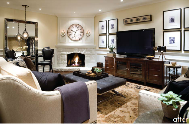
Onto episode 3. This is my least fave of the 3 episodes, but like usual, it’s the glam details that wowed me the most.
Love the TV stand (it’s like a 55” TV I believe…) The mirror in the left handside of the room makes the space look modern. The wainscoting is a nod to the traditional. And can you believe the walls are just painted wood paneling? Seriously! Look at the before pictures in the shopping guide. The fireplace is a focal point yet isn’t too busy looking.
The draperies are luscious. Photographer’s lamp is an unexpected touch that meshes well with the vibe of this family room. And that pendant in front of the mirror is just the icing on the cake.
She’s a design goddess.
So, what’s the point of me showing you all these pretty pictures? Well, to ask you this question: which TV show/magazine/designer inspires YOU the most when it comes to your home?
And the point is also to hint that DH and I are beginning to start working on the breakfast nook and our master bedroom. I’ll be posting a blog entry about each of these rooms in the upcoming week along with a source list of items that maybe, kinda, sorta look like the ones used in the episode but are easy to buy and afford. Who doesn’t love the luxe for less?
Come on dish- who gives you design-gasms?


No comments:
Post a Comment