Wednesday, July 20, 2011

No Time for Blogging {DIY}

Well, hello there. Long time no chat, right? I know. But we’ve made more progress on the dining room, which means I’ve been both busy and without a place for my PC at times. Yes, I have my netbook, but nothing is better for blogging than a desktop computer where I can type easily, freely and comfortably. So here I am.

Can you believe there are less than 2 weeks until BlogHer 11? Yikes! I’m nervous. But before I delve into that (maybe), I need some help with tying up some loose ends on my dining room.

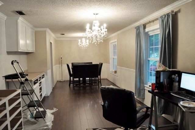
First of all, we got rid of that heinous ceiling fan in favor of a sparkly chandelier. We also added a light fixture where there wasn’t one before. AND we also installed new wide plank, handscraped flooring.

Before:

image

After:

room

The paint color looks SUPER different in each picture, but I assure you it’s the same color in both.

The chandeliers are stunning. They are gorgeous. My heart melts every time I stare at them. And I do that daily.

720blog1

720blog7

The best thing about these chandeliers? The price. I snagged them for $49 each at Home Depot. You can, too. Go on, I’ll wait. I should note that it’s $49 once you add it your cart. Honestly, I almost purchased these chandeliers a month ago and they would have cost me $99 each. That is twice as much. Oh and if you decide to buy, use eBates to get a percentage back from your purchase. I am all about being fabulous and thrifty.

Disclaimer: the chandelier is made of acrylic, not crystal, so if that’s important to you, don’t buy it. Personally, you can’t tell the difference unless you touch it. This is coming from a girl who is super picky about that sorta thing. These chandys are STUNNING. Promise.

What else has changed? Well, this wall was torturing me. At first it was white…

image

Then I painted it urbane bronze from Sherwin Williams…

image

And I told myself I liked it. You all told me you liked it.

I hated it.

Why? Well, I felt like then I was going more and more into dark accents, and therefore a dark room. Complete opposite of my original intention/inspiration:

image

That’s why I painted over the urbane bronze. I can finally rest again.

720blog3

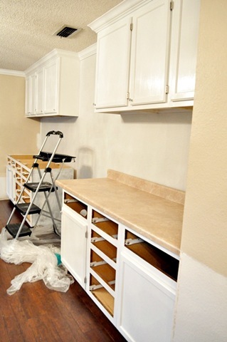
It’s a gray, almost white color- silverpointe by Sherwin Williams. It’s subtle, calm, and will look good with most color palettes that I love. Oh and hey, you can also get a glimpse of our new countertops!

I’ve talked about curtains before, and I am coming to the conclusion that I am cheap/poor, I need 95” long curtains and that those 2 things are going to make it impossible to find stylish curtains. For now I hung up some Target curtains I had on hand to see if I liked the color/length. Love the color, hate the 84” length.

720blog2

720blog6

The color looks a bit more aqua-ish in person rather than the slate blue in the pics. That’s what happens when you decide to blog at 8 pm when the sun has left the premises.

I am liking the color, loving even, but do you all think I need pattern? I don’t want my dining/office/living room to feel one-dimensional, safe, boring.

I looked at the Pier 1 peacock curtains…no go. Too dark, too much gold because of the feathers.

image

Then I bought these from Amazon:

image

The color was baby blue, the design thread is copper, they had random snags/tears/stains, plus they weren’t lined. Back to Amazon they went. Oh and in case you do buy them, make sure they’re all the right length. The ones I had varied from 79”-82”. Not cool.

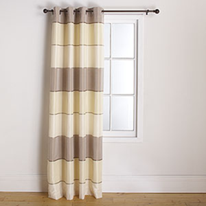
I saw these beauties at World Market a few weeks back, and I cannot get them out of my mind. They are gorgeous in person; the pics on their website do not do them justice. Period.

image

One problem: $43 per panel. That’d be about $200 with tax/shipping on 4 curtain panels. FOUR. I know this may not seem like much to some people, but to me, that’s hard to swallow. They were on sale (in-store only) last week, and as you may have guessed, they were sold out. They would have cost me only about $31/panel. And even worse? The guy said they’re discontinued.

Why????

They’re still available on the website, in the length I need, but not at the sale price I want. Come on World Market, put out a coupon ASAP.

I’ve searched high and low on the internet for something that strikes my fancy, and I keep coming up empty handed. The ones I currently have up (the blue ones) are available in the 95” length from Target, but I really want to have some sort of pattern or interesting feature to the curtains. I’ve looked at JCP, Amazon, Target, Wal-Mart, Sears, KMart, Brylane Home, Curtain Works, IKEA, World Market, Pier 1, Marshalls, Ross, Dillards, Kohls, Macys… is there anywhere I am missing? Help!

Ah, it feels so good to talk to you all again. Hopefully this room will be done soon so I can blog, tweet and ramble to all of you lovely people.

Now help me find some curtains!

Please?

0 comments:

Sunday, July 3, 2011

Scavenger Hunt Sunday {July 3rd, 2011}

I am back with 5 new photos for scavenger hunt Sunday! YAY. I thought this week’s items were a bit more challenging then last week’s, but here’s my interpretation of them!

1.) Pop of Color

popofcolor

This is a necklace I made for my Etsy store. Want it? Grab it here for $15 (use code BLOGHER11 for 20% off anything in my jewelry shop!)

2.) Crossing Thresholds

threshold

Out of nowhere I saw this abandoned double-decker bus (more photos to come soon!) and I snapped this photo with this specific prompt in mind. To me, it appears one would have to go through the bus to get to the outdoors or to get past the zombies hiding inside. What can I say? I have a crazy imagination.

3.) X-Ray

x-ray

I had absolutely no idea what to do for this one because I do not have an x-ray on hand. Instead I took my earrings and tried to make them funky and kinda x-ray looking…and I failed. But hey, I tried. Just for reference, here’s the original photo:

x-ray2

4.) Toy

Toy

This is a picture I took last year (my one non-new pic) of my sister-in-law playing with her son/my nephew. I love this picture because she looks happy and so does he. It’s like a captured a small moment in time.

5.) Hidden or Farm

hidden

I walk on a trail here in town that is 1.5 miles long and is basically left pretty much the way mother nature created it with the exception of the paved trail. There’s a section where all the branches droop down around this one tree to kind of hide it and it ends up creating an interesting canopy effect. Standing outside of it reminds me of a secret passage way to somewhere magical. I wanted this photo to feel a bit ethereal and mysterious. Maybe I should lay off the Harry Potter books, huh? A girl can dream.

Hope you enjoyed my scavenger hunt photos! See you next Sunday with a new set of 5 photos.

0 comments:

Saturday, July 2, 2011

Metallic Furniture {DIY Tutorial}

Metallic furniture pieces, along with it’s soul-sister counterpart mirrored furniture, is all the rage right now. Unfortunately, it’s also expensive. Here are some examples of some lovely pieces of metallic furniture:
image
Source: Better After Blog
image
Source: Furniture Fashion
And if you want a tutorial…
image
There’s an excellent one here at the source of the above pic: Little Miss Penny Wenny.


Or you can stick around for my tutorial, which involves less steps and less money, but may not be your cup of tea.
Here’s what my little stand looked like. I bought this probably back in 2009 or so for about $15. I’ll never forget the moment I laid my eyes on it…I was driving home from work and I saw it on the sidewalk of a little resale shop here in town. I busted a U in the road, and I was in love with the lovely details on the door. I bought it on the spot and holy hell…that cabinet was a PAIN to put in my car. It was windy and I was in a skirt, but I put that sucker in the backseat and home it went.


Two years later, I am finally ready to make it into something nifty.
Before1
The door isn’t perfectly square (see the gap in the upper left corner of the door) and the top was all messed up. Oh and the paint drips in the front, too. What a piece of work.


My first step was to sand the paint off:
Sand1
But. that was proving to take up a TON of time and sandpaper, so I remembered we had paint stripper because this was around the time of the unfortunate Rustoleum cabinet transformation issue.

Now, let me preface the paint stripper step by saying something to you, dear reader, bluntly. This stuff will effing burn your face off. No joke. You MUST wear gloves (not the cheapy latex doctor kind, but HEAVY DUTY gloves). You must protect your eyes, face, any body part you would like to keep skin on. Yes, skin. I used this when it was windy…OHMYGAWD. Little drops would land on my skin and I felt I was going to die. The only relief I got was when I would run my body part under cold, cold water. Oh and prayer because it BURNS LIKE A MOFO.


There’s a part of my eye glasses that got touched by the paint stripper, and now it looks like my glasses have a bald spot. IT IS STRONG.


Protect yourself like you would from a Vegas hooker, ok? It’s that harmful y’all.


After taking all the precautions necessary, I applied the paint stripper to the cabinet using a regular paint brush:
Paintstrip1
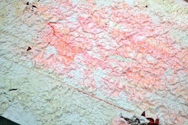
It’s orange and within seconds it starts eating away at your paint. This picture above is at about 30 seconds after application.
Paintstrip2
I gave it about 15 minutes and then grabbed my plastic scraper tool (that yellow thing) and the paint scrapes right off. If your piece has a ton of paint like mine did, you might want to do this step a few times. I did it about 2-3 times per side. It is a heck of a lot quicker than sanding repeatedly.
paintstrip3
It all clumps together so you can clean up easily.
paintstrip5
After you’ve gotten as much paint off as you can, sand it and you’ll have a lovely surface like this.
Paintstrip4
Now I was ready to paint! Spray paint that is. I love Krylon products and knew I wanted to try out their metallic spray paint for this cabinet.
Cans1
I bought both the satin nickel and the brilliant silver and sprayed both onto wood to see which color I liked better.
Example1
Satin nickel is on left, brilliant silver is on the right. I ended up choosing satin nickel and used 3 cans for this project. I paid about $3ish for each can at Wal-Mart.
Ready
And then I spray painted all the sides of my cabinet. I didn’t prime, and in hindsight I should have. It might have used less spray paint, but I am lazy and like quick results. I’ll admit it. I did light, even coats to achieve a smooth, even finish.


I don’t have pics of the next step, but I also had to buy new legs for the stand. I had to buy little silver plates to screw onto the bottom so I’d have a place to screw the leg onto. The 4 legs + 4 plates cost me about $15.
Finally, I brought it all back inside and put it back in my foyer. I love it! And ignore my DIY family artwork (also made using Krylon products)…I love it, but it just doesn’t look proportional in the grand scheme of things.
krylon1
Then my husband waltzes in…
krylon2
Then Pee Wee wants to be in the pics, too. I love my family. What a bunch of crazies we all are.
krylon3
But here she is in all her satin nickel beauty:
krylon4
A gray lacquer tray from Ross graces the top. A handy place to put my earrings, keys and magazines to read.
krylon5
A close-up of the finish. While the finish is smooth, I like that it’s not perfect. It looks rough in spots, which was my goal. I wanted a piece of metallic furniture that looked a bit aged.
krylon6
And from another angle:
krylon7
I love it. So easy, so affordable.


Cost:
Cabinet- $15
Paint- $10
Legs + Hardware- $12
Time invested: About 2-3 hours total.


Under $40 for a metallic furniture piece (with storage!) for my foyer. Not too shabby. Hope you enjoyed this tutorial. As I mentioned before, Krylon did send me products to try out that I am planning on showcasing on here soon (very soon!) but this particular project was all paid for by yours truly. I love Krylon that much. Well, what do you think? Do you love metallic furniture?

0 comments: