Sunday, February 27, 2011

Stream of Consciousness {Stalled}

#SOCsunday


Today I am participating in Stream of Consciousness Sunday, and we’ll just see what happens, ok? Thanks to All Things Fadra for creating this lovely idea/prompt/party.

----------------------------------------------------------

I feel stalled in life right now, which seems weird considering I am doing OK. Really, I am. However, the state of Texas has decided to cut educational stuff in it’s attempt to whittle down the budget.

I work in education. I live in Texas. I don’t want to lose my job.

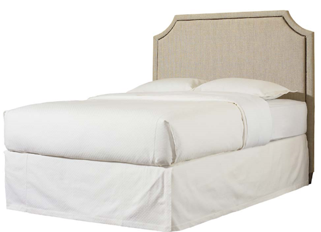
This fear makes me not want to do almost anything because I feel uncertain about the future. There’s a bed we like from Havertys, there’s a dining room I’d love to makeover, there’s a bathroom I want to remodel…and I will do none of it until I feel comfortable about what’s coming ahead. I do know that life is all about uncertainty, and while I usually can deal with that, the thought of having to pay bills and such without a job makes me want to just not spend a dime at all.

Overall, I feel stalled. I want to move forward but my heart is sank so low that I just feel like I am suffocating sometimes. I just want to breathe. I want to breathe freely.

And I really want that damn bed from Havertys. How selfish does that sound? I think it’ll all work out one way or another, but I just want knowledge and comfort so I can live my life.

And man did I find some really awesome tile I would use if I could just start that remodeling project. I probably should cut down on my HGTV watching, but I feel most at peace while watching that channel. I love the beautiful ideas.

One day. Someday.

--------------------------------------------------------

This was my 5 minute Stream of Consciousness Sunday post. It’s five minutes of your time and a brain dump. Want to try it? Here are the rules…

    • Set a timer and write for 5 minutes only.
    • Write an intro to the post if you want but don’t edit the post. No proofreading or spell checking. This is writing in the raw.
    • Publish it somewhere. Anywhere. The back door to your blog if you want. But make it accessible.
    • Add the Stream of Consciousness Sunday badge to your post.
    • Go to all.things.fadra. and link up your post.
    • Visit your fellow bloggers and show some love.

0 comments:

Sunday, February 20, 2011

The Glam Life {Randomness}

Before I start this post, I want to congratulate Brittany for winning the UPrinting giveaway AND for finishing her first half-marathon today. She is a rockstar! I love you girl. And thanks again to UPrinting for hosting the giveaway last week. If you like them as much as I do, make sure to like them on Facebook, too.

image

Ever wish your life was just a bit more glamorous? Not like red carpet glam, because let’s face it, most of us are nowhere near celebrity status. But just a bit more ooh-and-aah and less hmph and gggrr? Anyone? I know I can’t be alone in this feeling. One of my new year’s goals was to have a year of beauty. Beauty inside AND out. I vowed to take better care of my skin, apply makeup better, and even straighten my crazy hair more often…this lasted about 1 week because at the same time I vowed to do ALL of that, I also vowed to get healthy.

And apparently beauty and health don’t always see eye to eye. Let me elaborate.

I am currently about halfway done with my 100 days of exercise challenge- I still have 49 more days to go. Basically, this means I workout at least 30 minutes EVERY. single. day. Without fail. Even worse, this means I sweat daily. I sweat a lot. Which means it isn’t easy or feasible to keep my hair nice, straight and clean looking. I’ve tried a few dry shampoos, and they don’t make my hair feel and look as clean as I’d like, so the straight hair thing has gone out the window. I do semi-decent on the makeup application, but I don’t look anywhere near as nice as I’d like when I head out the door in the morning. I throw my curly hair into a messy bun kinda thing and I move on with my day.

Then there’s clothing. Luckily, the scale has moved down 18.6 pounds this year (woo!) so I am fitting into my clothes a lot better than I was before. But again, my working out daily leads me to wearing t-shirts, sports bras and workout pants most evenings and weekends. Once I workout and shower, the last thing on my mind is looking cute, especially if I am just at home. So, I throw on a clean t-shirt and lounge pants after I shower.

I feel frumpy and I do not like it. I look at pretty clothes, accessories and such online everyday to try to inspire myself to inject some glam in my life. I just want a bit of glam. Deep down I know if I truly, truly wanted to, I could MAKE time to straighten my rambunctious curly hair daily, but lord, just shoot me. That would be insane. And tiring. And insane! I have a lot of hair!

Glam. I want some. I need some.

So I am here to ask you, my loyal, lovely readers (all 4 of you), what should I do? Accept that right now my life is about health/exercise so I can be glam later? Should I buy some cute lounge wear to wear at home? Do I need to chop my hair a bit so I could maybe straighten it daily? Should I set aside 1-2 days a week where I straighten my hair? Do I need to just shut up?

I hope you have a glamorous evening. As for me...my t-shirt and sweats need to go finish up some laundry.

And if you wanna follow along with even more of my random nonsense, I now have a Tumblr. It’s going to be used mainly as inspiration for all things beautiful in regards to home, body, mind, and life.

0 comments:

Sunday, February 13, 2011

Multi-Purpose Room {The Plans}

This picture haunts me. Everyday, I swear I look at it for at least 5 minutes, everyday.

image

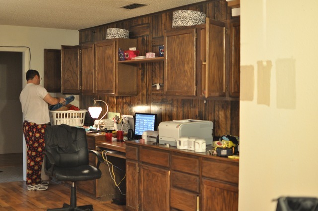
Why am I so obsessed with this photo? Well, it’s the exact same shape/size as MY dining room. We have windows on the right hand side. We have a wall of cabinets on the left handside. No fireplace and no door leading to the outside, but other than that, pretty similar. In my crazy mind, this means I can do something pretty similar.

Here’s our wall of cabinets (excuse DH in his PJs…and the paint swatches on the wall)

DSC_0229

Long room with windows on the right handside (you can’t see the other window here, sorry).

DSC_0236

Gorgeous dog. Love him.

DSC_0249

So, last week we had 2 days off from work due to the bad weather, so we decided to get to work on my vision of Candice Olson like rooms and so we started with the dining room. Doors came off the cabinets: (remember to number them!) I also made this diagram to help us out and it’s to scale (1 inch=1 foot).

image

DSC_0245

Progress:

DSC_0255

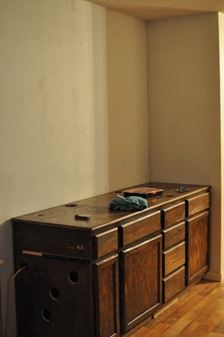
Moved the bottom cabinets away from the wall:

DSC_0259

DSC_0267

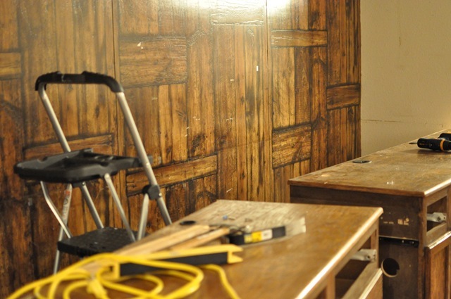
Then DH carefully used a pry bar to start removing the wood paneling (thank HEAVENS there was drywall behind it or else I might have given up!)

DSC_0271

Once the whole section was loose, we’d remove the panel (there ended up being 4) and then we’d move them into the garage.

DSC_0272

I then had a lot of holes, nails and dirt to clean/patch up on this wall.

DSC_0274

DSC_0275

I grabbed Lysol wipes to clean the wall, a hammer to remove all the old nails that were holding the wood paneling in place, and some joint compound to patch up all the holes.

DSC_0279

Here’s what it looks like when the joint compound is still wet- on the left handside of the picture you can see what it looks like when dry- it blends in!

DSC_0276

Here’s what it looks like once it’s all dry.

DSC_0303

Then I primed it with some of the Kilz low-VOC primer- LOVE that stuff. Only $18 a gallon at Wal-Mart and virtually no odor.

DSC_0310

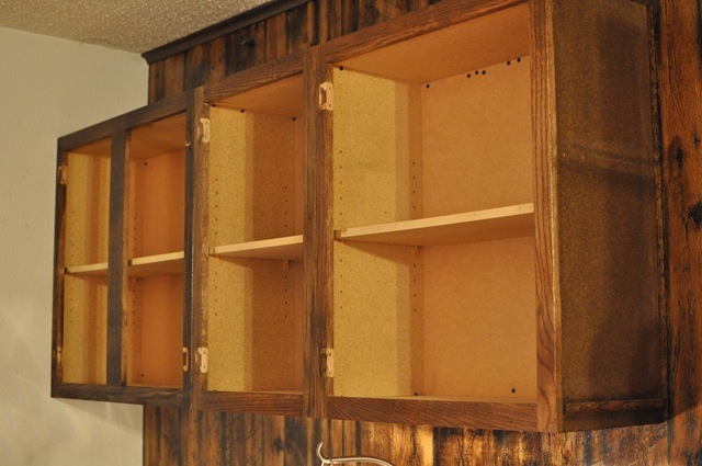
Then DH and I marked all the studs (DH being one of the studs- LOVE YOU!) and hung the cabinets back up…but this time, they’re a lot higher.

DSC_0309

Now, I bet you’re wondering why I moved them up and exactly what else is going to be done to this room, but you’ll just have to be patient because the rest of the details will be in another post. I can show you a few things to hold you over until then:

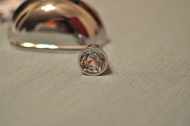
My inspiration picture has crisp white cabinets, so my cabinets will be white eventually, I’m working on it. The bin pulls are very prominent on the drawer fronts, so I found some chrome ones on eBay for a great price of $1.62 each shipped. I also bought chrome knobs with a faceted clear-diamond like crystal inside the knob for about $2.50 each on eBay. I love eBay for finding affordable hardware- check it out next time you need some pulls/knobs.

DSC_0336

DSC_0341

We’ve also decided on a paint color- Balanced Beige by Sherwin Williams. We chose it because, well, it was the most balanced. It looked the best regardless of light/time of day, which is super important.

The main concern I have with the dining room space is that it serves 2 purposes- dining room AND my headquarters for my Etsy business. My goal during this room transformation is to find a way to not have it look like my office and have it be able to stand alone as a dining room. However, in all reality, it HAS to be able to serve as an office space for me/my store. I’ll be walking a fine line between aesthetics and function to make this room transformation chic, efficient and affordable. Do you have any tips? Have you been working on a makeover of your own lately?

0 comments:

Friday, February 11, 2011

Business Cards {Giveaway}

Ever been out somewhere and wish you had a business card so people can connect with you online via your blog, Twitter or Facebook? Especially if you’re heading out to a conference like Fitbloggin or BlogHer this year, you NEED business cards.

You need FREE business cards, and that’s where UPrinting (one of my lovely sponsors) comes in to give one of my lucky readers a free set of die-cut business cards. That’s right- these aren’t your ordinary rectangular business cards- they’re creative and will help you stand out.

image

250 Die-Cut Business Cards for One (1) Winner
1.75” x 3.5”, 2” x 3.5”, or 2” x 2”; 2.5” Diameter (Circle)
14pt Cardstock Gloss / Matte / High Gloss (UV), or 13pt Cardstock Uncoated
Front Only or Front and Back printing
Restriction: Limited to US residents 18 years old and above only.

I’ve used UPrinting a few times, and I love their products. They are great quality, impressive and affordable. But you can’t get more affordable than FREE, so if you need new business cards for any reason, enter this giveaway.

The Deets:

1.) Only 1-entry per person

2.) To enter just leave me a comment stating what you’d use your free business cards for.

3.) Disclosure: I am receiving a free set of business cards by hosting this giveaway, but the opinions expressed in the post are solely my own and were not influenced by the freebie.

Contest runs from right NOW until next Friday, February 18, 2011 at noon CST.

0 comments:

Sunday, February 6, 2011

Sweetness {Guest Blog Post}

Hey everyone! Laurel here from Go Against the Grain (http://agoodbuild.wordpress.com). I love to create yummy things and decorate them for any occasions. I was very excited  when Monica asked if I was interested in doing a guest blog post so of course I said yes!

Valentine's Day is coming up and if you have been in a store lately, you have seen all kinds of tasty looking things to eat. If you stop by my blog at any time you will see I LOVE cupcakes and sweet things so I thought I'd share a fun, tasty and Valentine's related creation with you all!  Rice Crispy Treat Pops!

To make these you will need:
Rice crispy treats, either homemade or pre-made. (I used  pre-made!)
Lollypop sticks- enough for how many pops you want to make.
Sprinkles, colored sugar, whatever you want to decorate with.
White candy melts
Wax paper

image
Step 1:
Lay out a large sheet of wax paper. Take the lolly pop sticks and push them into the rice crispy treats far enough that they don't wobble when you hold them up.

image

Step 2:
Follow the directions on your candy melts for melting them. One by one take each pop and dip it into the melted candy. Tap them on the side of the bowl a few times to get off the excess.

image

Step 3:
Grab your decorations and sprinkle onto the coated part of the pop and then place it, standing up, on the wax paper to let it harden. Repeat till all your pops are coated and decorated!

image

Step 4:
Enjoy!

image

You can also add fun little things to the sticks when you display them if you want like I did. Ribbon, little flags to personalize them, so many great options! One of the great parts of this tasty creation is that you can change it up for any occasion! Using different colored candy melts, sprinkles, there is no end!

I hope you enjoyed my little tutorial, if you want to see more of what I do check out my blog (www.agoodbuild.wordpress.com) and my Etsy shop (www.goagainstthegrain.etsy.com)!

-----------------------------------------------------------------------

Thanks so much Laurel! I am not a huge rice krispies treat fan, but boy do these sure look cute and tasty. And they’re easy, too! Laurel is the first of a series of guest bloggers that will be gracing us with their lovely words, stories and tips to live a more beautiful life. From recipes to crafts to fitness to weight loss, my guest bloggers will ROCK YOUR SOCKS off. My main motivation for having guest bloggers is to show off my fabulous bloggy friends (love you all!) and to also enrich the content of my blog a little bit. The bloggers that are participating are friendly, insightful and successful at many things, so why not share the love?

Now, I am off to watch the Super Bowl. Ok, really I am watching because the Super Bowl is a gateway into Glee. Love me some Glee!

Happy Sunday!

0 comments:

Thursday, February 3, 2011

Monochromatic Bedroom {Luxe for Less}

I am back for some more Candice Olson love. Last time, I sourced out some of the key pieces/elements from the first episode of her show Candice Tells All.

I’m moving onto episode 2: Restful Monochromatic Design.

It is fabulous, and I’m here to help you create this sort of room in your home on the cheap. Well, cheaper than if she were to do it, k? Let’s swoon over the room before we delve into the products- and boy are there a TON.

image

This room is anything but your typical boring beige. It’s got shades of white, gray, beige with touches of glamour/sparkle.

Let’s get started shall we?

The bed is quite obviously the center of attention in this room. There are lots of stores which offer a similar shape if you’d like to buy:

image

Prices are about $900 for a king headboard + $140 for tufting from Ethan Allen.

image

Another option is the Florence Headboard from Bassett. Starting at $549 for a queen.

Or you always make your own:

image

Image credit: Southern Exposure

Tutorial on how to make the headboard can be found here.

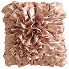
Candice really brought depth to the room by her use of pillows. textures and fabrics, so here are a few options for the bed throw pillows:

image

From Pier 1 Imports, $30

image

From ZGallerie, $65

image

From Etsy seller Yellow Bug Boutique, $37

image

From Wal-Mart, $15

image

From Wal-Mart, $12

All the pillows have different textures, therefore creating a sense of interest.

And now for some bedding ideas:

image

From Overstock, $45+ for the sheets

image

From Macys, $$$

image

From Anna’s Linens, $30-$150

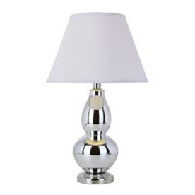
Moving onto the lamps- they are tall, modern and chrome.

image

image

From Home Depot, $40

image

From Lowes, $70

image

From Amazon, $60 for the pair of lamps (yes, 2!!)

Now for some of the other fabulous accessories in the room:

image

The chandelier:

image

Maria Theresa Chandelier from Home Depot, $100 (stunning in person, trust me!)

image

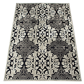
The rug:

image

From Rugs USA, $50+ depending on size

I know this isn’t just like it, but I think this rug could work as well:

image

From ZGallerie, $300

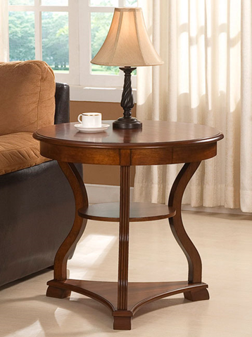
The side table:

image

From Overstock, $102

The chair:

image

From World Market, $400

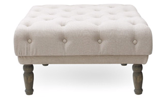
The ottoman:

image

From Lamps Plus, $300

image

Curtains:

image

From CurtainWorks, $21-$32 per panel

Ottoman:

image

From Urban Home, $139

And unfortunately, they don’t picture the wall where Candice put a desk & venetian mirror, but just for fun, here’s what the mirror looks like (just imagine it goes to the floor):

image

From Horchow, $900

Hope these little finds help you create a restful, monochromatic space. This episode is what is inspiring our entire master bedroom- can’t wait to show you what we come up with!

Do you like monochromatic design or do you prefer more bold colors? What’s your favorite part of this room?

Coming up soon- episode 3 source guide!

image

0 comments: