Multi-Purpose Room {The Plans}
This picture haunts me. Everyday, I swear I look at it for at least 5 minutes, everyday.
Why am I so obsessed with this photo? Well, it’s the exact same shape/size as MY dining room. We have windows on the right hand side. We have a wall of cabinets on the left handside. No fireplace and no door leading to the outside, but other than that, pretty similar. In my crazy mind, this means I can do something pretty similar.
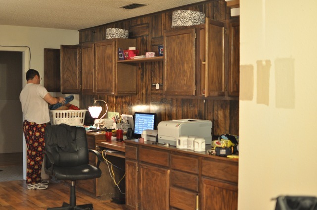
Here’s our wall of cabinets (excuse DH in his PJs…and the paint swatches on the wall)
Long room with windows on the right handside (you can’t see the other window here, sorry).
Gorgeous dog. Love him.
So, last week we had 2 days off from work due to the bad weather, so we decided to get to work on my vision of Candice Olson like rooms and so we started with the dining room. Doors came off the cabinets: (remember to number them!) I also made this diagram to help us out and it’s to scale (1 inch=1 foot).
Progress:
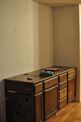
Moved the bottom cabinets away from the wall:
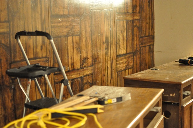
Then DH carefully used a pry bar to start removing the wood paneling (thank HEAVENS there was drywall behind it or else I might have given up!)
Once the whole section was loose, we’d remove the panel (there ended up being 4) and then we’d move them into the garage.
I then had a lot of holes, nails and dirt to clean/patch up on this wall.
I grabbed Lysol wipes to clean the wall, a hammer to remove all the old nails that were holding the wood paneling in place, and some joint compound to patch up all the holes.
Here’s what it looks like when the joint compound is still wet- on the left handside of the picture you can see what it looks like when dry- it blends in!
Here’s what it looks like once it’s all dry.
Then I primed it with some of the Kilz low-VOC primer- LOVE that stuff. Only $18 a gallon at Wal-Mart and virtually no odor.
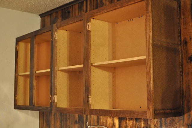
Then DH and I marked all the studs (DH being one of the studs- LOVE YOU!) and hung the cabinets back up…but this time, they’re a lot higher.
Now, I bet you’re wondering why I moved them up and exactly what else is going to be done to this room, but you’ll just have to be patient because the rest of the details will be in another post. I can show you a few things to hold you over until then:
My inspiration picture has crisp white cabinets, so my cabinets will be white eventually, I’m working on it. The bin pulls are very prominent on the drawer fronts, so I found some chrome ones on eBay for a great price of $1.62 each shipped. I also bought chrome knobs with a faceted clear-diamond like crystal inside the knob for about $2.50 each on eBay. I love eBay for finding affordable hardware- check it out next time you need some pulls/knobs.
We’ve also decided on a paint color- Balanced Beige by Sherwin Williams. We chose it because, well, it was the most balanced. It looked the best regardless of light/time of day, which is super important.
The main concern I have with the dining room space is that it serves 2 purposes- dining room AND my headquarters for my Etsy business. My goal during this room transformation is to find a way to not have it look like my office and have it be able to stand alone as a dining room. However, in all reality, it HAS to be able to serve as an office space for me/my store. I’ll be walking a fine line between aesthetics and function to make this room transformation chic, efficient and affordable. Do you have any tips? Have you been working on a makeover of your own lately?












0 comments:
Post a Comment