Wednesday, July 21, 2010

Winner, winner!!

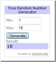
18

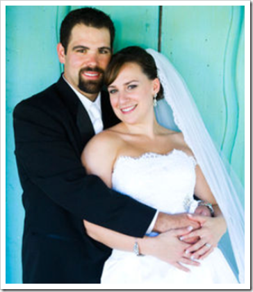
Jackie my love, you won!

Jackie’s winning comment:

  • Jackie's Entry #3:
    4.) Become a follower of this blog:
    TOTALLY FOLLOW THE BLOG!!!!!!!

Congrats friend! Whatcha gonna buy me from CSN Stores? ;o)

  101_1498

Jackie is the first one from the left with the pretty little girl in her belly at the time. I am in the center with my lovely houndstooth blazer. We’re standing outside of Wicked on Broadway in NYC in November 2009.

I met her on The Knot in 2008, and we’ve been friends ever since. I even flew to visit her in November of 2009, and I sobbed the whole way home. I HAD SO MUCH FUN!

Becca is the girl to the right of me and Stacy is next to her and I just adore these girls so much. We’ve formed a tight bond although we’re online friends, but I talk to them daily. They know so much about me and what is going on in my life. They mean the world to me.

In our tight knit group of May 2009 Knotties, there is a beautiful woman named Kelly Freitas, and shortly after returning from her honeymoon last May, she found out she had breast cancer. Her blog tells her story better than I can, and I suggest you read about her fight. Unfortunately, my dear friend Kelly passed away last Friday after a year long battle with cancer. I’ve been wanting to blog about it, but just didn’t know how, I guess. How do you blog about something so incredibly unfair and tragic? I still am having trouble coming to terms with her loss, and just thinking about it makes me cry instantly. It hurts a lot.

I miss Kelly dearly, and it makes me realize that friends, family and loved ones can be taken away from us in a split second. Cherish the people in your life (whether in real life or online), relish in the beautiful moments that happen everyday, and live your life to the fullest. Reach out to people you haven’t talked to in awhile, hug people you love.

image

image 

We will miss you Kelly- you are an inspiration to me daily to live life with a smile.

0 comments:

Wordless Wednesday {7.21.10}

DSC_0064

0 comments:

Tuesday, July 20, 2010

Designed to Sell: Part 2

Today I shall continue with some of the things that are a turn-off to buyers…or at least to Daniel and I. Usually they are small things like just picking up stuff off the floor, decluttering and taking 5 seconds to think about how to take the BEST picture. If you want sell quickly, we feel these are things that are important enough to spend a Sunday afternoon doing before putting your house on the market.

In my first installment, I went over kitchens, bathrooms, living rooms etc. so today we’ll be venturing off into bedrooms (mostly master suites) and backyards. With a random scarecrow thrown in the mix. You’ll see.

Like I said, and like many HGTV folks say, the kitchen & bathrooms are usually the things that sell the home. I know those are our top 2, but coming in a very close third and fourth are master suites and backyards.

Here are some awful master suites currently on the market in Beeville:

bed5

^This bedroom is in a $149,000+ home. It looks like it was a part of the set for That 70’s Show. A fresh coat of white paint would have done wonders for this photo, and would be a quick, inexpensive fix. The room is quite large, but most buyers would probably be turned off right away.

This suite looks spacious, but the bed frame is TOUCHING the ceiling. This makes me feel claustrophobic. Furthermore, put away the orange shirt, the ironing board, the dust rag on the coffee table and perhaps the red slippers. If they’re trying to stage this to appeal to a buyer, they’ve gone about it the wrong way. An INSTANT way to make this room feel large (because it truly is) is to remove the canopy from the bed. You’d still be left with a massive poster bed, but at least it wouldn’t feel as small.
bed7

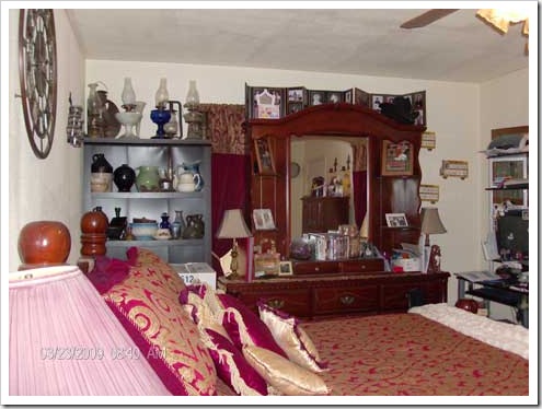
I am getting an anxiety attack just looking at the above picture. I think this bedroom may be beyond remedy.

bed4

This photo isn’t awful, but it doesn’t really show me anything but a quilt, half a dresser and a chest. What’s the point?

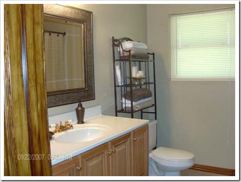
Also, TURN OFF THE DATE/TIME STAMP FEATURE of your camera or crop it out if you don’t know how! Especially if it’s wrong. This photo was apparently taken 1/22/2007 at 5:37 pm. If someone not familiar with the area saw this photo, they may very well assume the DOM is high. DOM=days on market. The higher the DOM, the more a buyer thinks, “Why hasn’t this sold yet?”

Especially after 3.5 years.

Daniel and I do not have children yet, but for someone that does, photos of children’s bedrooms like this may scare them:

Too. Much. Stuff. I know people live here, but your kid does not use those items every day.

children1

Attack of the stuffed animals. They’re taking a nap on the bed, keeping a watch in the crib, and trying to escape from the window. But apparently the kid uses the vacuum on occasion, so bonus points there.

Now let’s look at some GOOD examples:
bed1

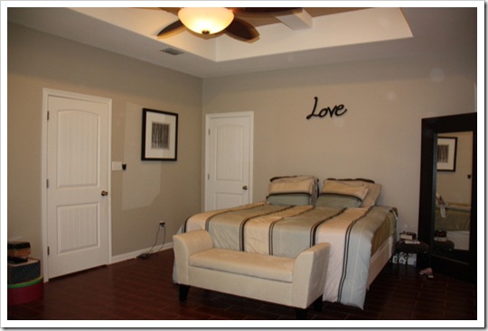
Plain, clean, spacious.

bed6

Again- plain, clean, spacious AND natural light. Bonus!

bed8

This rooms feel cozy, not crowded. Looks good overall.
bed9

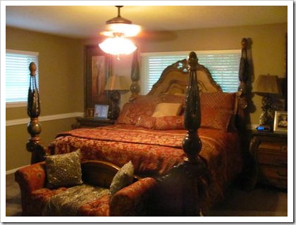
This one can go either way- for me, it feels small and it looks like if I sit up in bed, I could get hit in the head with a ceiling fan. But it at least looks neat.

children2

I couldn’t find many decent kids rooms, but this one is nice. The colors are very tween oriented, but it’s a cute, clean space that wouldn’t make me want to run for the hills. Easy to picture as a kids room, nursery, guest room, office, etc.

Why don’t we take this outside?

backyard1

What’s wrong with this picture? Well, it seems like a great space, but the shadows of the trees make it hard to see the hot tub in the corner and the swing set in the opposite corner. Not a horrible picture, but a different angle could have worked wonders in this photo.

backyard7

In this photo we seem to have an above ground swimming pool who is too shy to be in the picture. Either get it all in the picture or leave it for it’s own photo.

backyard4

All I see is a random handle in the bottom, lots of wires, wind chimes, a leaning BBQ pit, and a…Christmas tree? Too much going on here- this photo lacks focus.

backyard2

Nice, clean, simple.

backyard3

Spacious deck, plenty of dining room, a nice pit, pretty trees=a spot I would love to be in!

backyard5

I like the space, but I am thinking of all the leaves I’d have to rake. I mean, Daniel would have to rake. But nice space!

backyard6

Gorgeous gazebo, pool, and lots of shade. PARTY!
backyard8

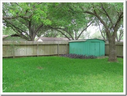
Can grass get any greener? Gorgeous!

So, there we have it. I think I covered some basic stuff that buyers look for when looking at photo listings of homes online. The photos online will immediately tell me whether or not I want to bother looking at your house in person. You want to get buyers into the door of your home and eventually into a contract, so first impressions are CRUCIAL in this tough market. Even in a small town competition can be stiff, so put your best foot forward by taking some time to think about how to stage, frame and light your pictures.

I know many realtors probably have just a basic point and shoot camera, and that’s fine! I am not saying to buy a fancy camera or hire a photographer, but open some windows, turn on some lamps, etc. to avoid having to use the flash. Angles are also huge- walk around to find the best shot, stand on a chair, lay on the floor and look up with your camera. Get creative!

Also, make sure your realtor takes a ton of photos. There’s no excuse for one listing to have 4 and another to have 16 photos. Also, declutter! I truly believe the more stuff you have in your photos=a higher DOM rate.

And lastly, don’t use stuffed animals or scarecrows as props.

laundry1

My next installment will be for buyers rather than sellers. I hope to have that up later this week, but for now, tell me what the most important room(s) were/are to you when looking for a home? What is the least important?
0 comments:

Monday, July 19, 2010

Book vs. Nook

I’ll fully admit it- I do not read books often. At all. I used to read TONS when I was a young girl. I read the Goosebumps books by R.L. Stein & the Baby Sitters Club Books.

I subscribe to like 8 different magazines, and all I do with them is flip through the pages and look for pretty pictures like I am 4-years old.

But lately, I started reading Breaking Dawn (Team Jacob! Simply because he is HAWT. And 18.) and the hour or so I spend laying in bed with that book is often times the most relaxing part of the day. There’s something amazing and therapeutic about getting lost in someone else’s world. It’s an escape, and a very welcome one when life can be stressful.

Therefore, I think I’d like to make time to read more. Now the question is do I read books or do I read books on an e-reader? I’ve done research on the e-readers before, and to me the Nook by Barnes & Noble is my favorite. I think there are pros and cons to buying books or buying a Nook.

endless_shelf_space_pod

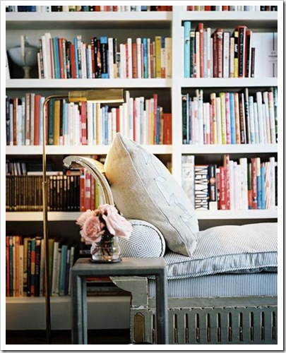
With a book, I just love the feel of it in my hands. It’s a ticket to Forks, a recipe for success, a good chuckle; it’s many things. I like the feel of a luscious, hardcover book. Then there’s the joy of accumulating a collection of books and having impressive bookshelves:

books

books2

books3

books4

However, I hate clutter, and I doubt I will ever have spaces as impressive as the ones in the above pictures (all from Decor Pad).

Then a Nook might be a good investment? Maybe? The price has come down a ton. I remember when I was first looking at the Nook + accessories it was going to be upwards of $300, but now the basic Wi-Fi version is $149. A steal, IMO. It’s portable, easy to use, and can hold a ton of books.

Oh, and it has cute accessories too!

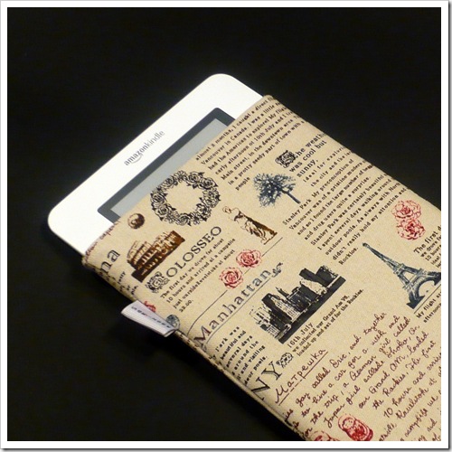
nookcase1

From Etsy

nook2

Also from Etsy

adler

Jonathan Adler Case at BN

See? Equally stylish, but far less clutter.

I do like that with either option, I can lounge in cozy, airy, delightful spots such as these: (again, all images from Decor Pad)

chair

chaise

readingspot

lounge

I think the biggest deciding factor might be whether or not I’ll ever buy and use these book ends. I’ve wanted them forever.

dog

So, tell me, would you prefer a book or a Nook? Why? Also, anyone have any good book recommendations?

Speaking of which, check out Gwen’s blog- she reads a ton, she’s a sweetie, and I hope to meet her at Blissdom ‘11. Wink, wink.

0 comments:

Saturday, July 17, 2010

Designed to Sell.

Not the TV show, but just in general…if your house is on the market, have you designed it to sell?

On the HGTV shows, Sabrina Soto or Sophie Whatever-her-last-name-is do these 30-minute shows where they take a home from unsellable to sellable. Usually for around $1,000-$2,000, which I guess isn’t a ton of money, but it might be if you’re already losing money by selling your home. Right?
Daniel and I search the local real estate listings DAILY. We probably know more about the current houses on the market than the realtors do. That’s rather sad, but I think it makes us a bit more educated about pricing, areas, and which houses have been sitting on the market for 2 years.

Today I am using pictures solely from Beeville area houses that are on the market. I’ll give picture credits to the following Beeville realty companies: Park-Breidenbach, The MGM Team & Rabe Real Estate.

We’ll start with the kitchen, because let’s face it, more often than not the kitchen will sell the home. Food is a major part of family get togethers, holidays, etc. so the kitchen is king.

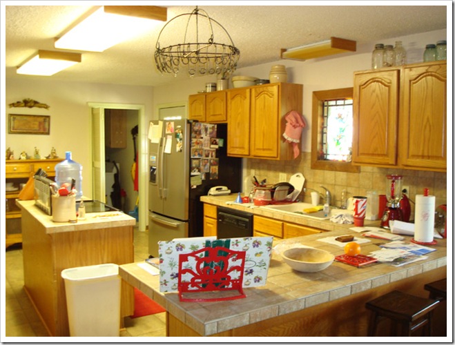
Here’s an example of a kitchen that is in a home that is on the market:

Sigh.

First of all, if you’re going to take pictures of a kitchen in a home that you’re selling, perhaps you should clear off the counters. All I can focus on is the red Stripes mug by the sink, the big jug of water on the island, the random thing hanging from the ceiling, the jars on top of the cabinets and the family photos on the very-nice-but-lost-in-the-mix french door refrigerator.

I realize these people are living here, but for the 10 minutes it takes to snap photos, throw all your crap in a box and make it look like the kitchen has never been used. Buyers do not care that you like the color red, drink water, and have a family album on your fridge- they care about finding a house. Their perfect house. You’re selling emotions first, function next. If I am not feeling the kitchen, I surely will not see myself functioning/using/cooking in it.

Here’s an example of a nice, clean looking kitchen:

Kitchen2

See the difference? I am not even comparing cabinets or finishes because one is obviously more high end than the other, but just look at cleanliness/orderliness of the 2nd picture. I’d feel comfy walking right in there and starting to make cookies. Before I even put in an offer…that’s just how I roll.

Next, the living room.

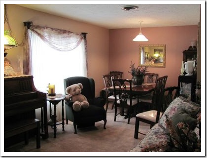
bearchair

Does the bear creep you out? Me too.

clutter

This living room has high ceilings that could be gorgeous, but I am so fixated on the baby poop green color on the walls, the toys in the corner, and the random stuff hanging on the glass doors. Oh, and the 4.51% interest.

TURN THE TV OFF! Buyers would much rather see a black screen than the EARN 4.51% INTEREST. Because now I am wondering what the 4.51% interest is on. And I have ZERO interest in the paint color and the toys. Move them out of the room. Those shelves in the corners are a prime spot to stage to make it look nice and useful, but all I can see are lots of picture frames and clutter. Not good.

Another sin (yes, sin) I see in Beeville is…well, you tell me what these next series of pictures have in common:

deer1

deer2

deer3

deer5

deer4

Oh deer.

There was even a house on the market about 2 years ago that had the deer in the NURSERY. Yeah, seriously. Awful.

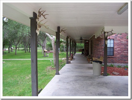
I can totally understand that people who hunt like to display their deer on the wall. However, there are people like me who are not too fond of killing animals for home decor (I realize people eat the meat though) and I simply do not want to see it on the walls. I do think storing deer busts would be difficult, but why not keep them confined to the man cave area of the house like this picture:

deer6

Now let’s look at examples of nice, inviting living room spaces with no dead animals:

spacious

^ That is a picture of the house we put an offer on and were rejected. Tears.

lr

lr2

lr3

lr4

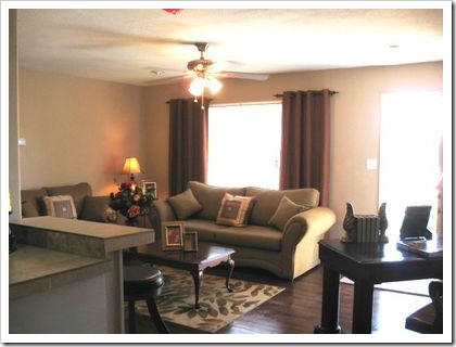
Nice. Spacious. Clean.

Now, I want you all to know I am picking homes from a HUGE range of prices so that I am not only featuring expensive homes as the “nice” pictures. In fact, most of the “bad” examples are from the most expensive homes.

That have not sold.

Just sayin’.

Now, the bathroom. I am SUPER picky about bathrooms. I do not care if it has a double vanity, a whirlpool tub, marble countertops, tile floors. I truly don’t. What do I care about?

Would I walk into the bathroom/tub/shower without flip flops?

carpetbathroom

Wow. Simply wow. Not only is there carpet in the bathroom, but it’s green. With light pink.

babybop

I think there are many dated bathrooms in Beeville, and dated can be fine, as shown here:

datedbutnice

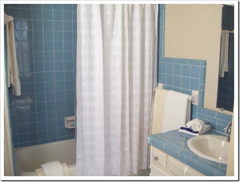
The tub looks clean, it’s a very nice, soothing color palette. Two thumbs up!

Some more good examples:

clean

clean2

clean3

clean4

Clean, clutter free.

Tomorrow I am going to touch on bedrooms, backyards, and angles.

What are some crazy things you’ve seen either when looking at houses online or in person?

0 comments: